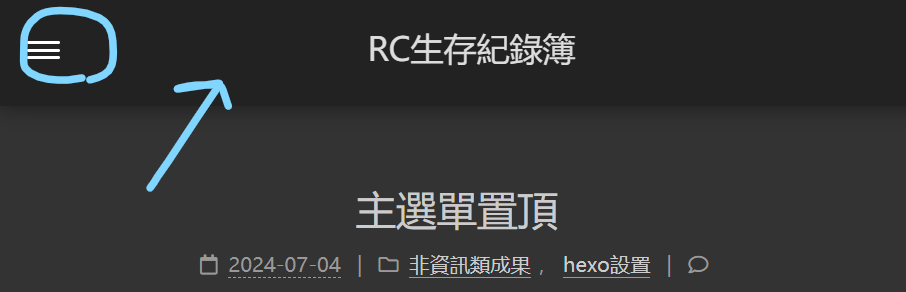
手機版主選單置頂
手機(縮小版)頁面主選單always display
[不專業設置]
新增樣式
新增以下程式碼於 themes/next/source/css/_custom/custom.styl
(若無該文件=>自行創建)
1
2
3
4
5
6
7
8
9
10
11
12
13
14
15
16
17
18
19
20
21
22
23
24
25
26
27
28
29
30
31
32
33
34
35
36
37
38
39
40
41
| @media (max-width: 768px) {
/* 手機(縮小版)頁面主選單always display */
.site-brand-container {
position: fixed;
top: 0;
width: 100%;
z-index: 1000;
background-color: #fff; /* 根據需要調整背景顏色 */
box-shadow: 0 2px 4px rgba(0, 0, 0, 0.1); /* 添加陰影以區分導航欄 */
}
.site-meta {
padding: 10px; /* 根據需要調整內邊距 */
}
.site-nav-toggle {
display: flex;
align-items: center; /* 垂直置中 */
}
.site-nav {
display: none;
position: fixed;
top: 60px; /* 根據導航切換按鈕的高度調整 */
width: 100%;
z-index: 999;
background-color: #222; /* 展開後的背景顏色 */
padding: 10px 0; /* 調整內邊距 */
}
.site-nav.active {
display: block !important;v
}
.main-inner {
padding-top: 60px; /* 根據導航欄高度調整 */
}
}
|
創建custom.js
於以下位置創建 source/js/custom.js
於custom.js新增以下程式碼
1
2
3
4
5
6
7
8
9
10
11
12
13
14
15
16
17
18
19
20
21
22
23
24
25
| document.addEventListener('DOMContentLoaded', function() {
var toggleMenu = document.querySelector('.toggle-menu');
var siteNav = document.querySelector('.site-nav');
toggleMenu.addEventListener('click', function() {
siteNav.classList.toggle('active');
});
});
// 在頁面載入時檢查屏幕寬度
function checkScreenWidth() {
// 否則隱藏主選單,顯示切換按鈕
document.querySelector('.site-nav').style.display = 'none';
document.querySelector('.site-nav-toggle').style.display = 'block';
}
// 綁定窗口大小變化事件
window.addEventListener('resize', checkScreenWidth);
// 頁面載入時立即執行一次檢查
checkScreenWidth();
|
配置注入自定義樣式和 JavaScript
新增(或替換)以下程式碼於 \themes\next_config.yml
1
2
3
4
5
6
7
| injects:
style:
- source/_custom/custom.styl
head:
- <link rel="stylesheet" href="/css/_custom/custom.css">
bottom:
- <script src="/js/custom.js"></script>
|